It has been long since we started working towards Mobile support layout at GuitarStreet. And it is out as a beta test. I want to share this story of How we did mobile version of our site.
First a basic understanding of our environment.
- Built using Open Source software on LAMP stack
- Using Flubber framework
- Every moment there are 10 Active users ( 3 – 4 of them are from mobile on an average)
We realized that our dropping rates for mobile was very high, the reason being our site was not built for mobile devices. To implement a mobile version of already existing website is different from implementing a mobile site from scratch. We had to keep in mind that it should not affect our existing users.
There were two important decisions that we took
- Native App vs Web App
- Responsive web design vs Adaptive web design.
Here is our view on these individual topics briefly,
Native vs Web App
Since GuitarStreet is an e-commerce platform, Majority of people visit only when they need to purchase or to do research. Typically this visit is one time, they don’t visit often to checkout the products. Asking them to download a Native App does not make sense in this case. So we decided to go ahead with Web App.
Responsive vs Adaptive
What is the difference?
Responsive web design (RWD) is a web design approach aimed at crafting sites to provide an optimal viewing experience—easy reading and navigation with a minimum of resizing, panning, and scrolling, without worrying about the capabilities of the device rendering.
On the other hand,
Adaptive web design is similar to RWD, except that this form of design not only does the content adapt to the size of the screen but it takes into account the capabilities of the device as well.
In the discussion there were two points that came up
- Keep the code base small.
- Keep current desktop version untouched.
Creating separate layout for every device out there would increase the complexity of product. Implementing AWD altogether is ruled out. But creating responsive layout will affect the current Desktop version and Mobile version will be heavy with unnecessary hidden layouts of desktop version.
So we thought of implementing a hybrid model.
Create an adaptive model to separate Mobile devices ( including tablets ) and Desktop devices. Once we detect it is Mobile device then render all the pages in different template which is responsive and looks like a web app. This works across all devices independent of their resolution.
Since we are using template based rendering, it took us hardly a week to setup our templates to support mobile devices, after that using jQuery mobile and CSS3 we designed our responsive layouts. Flubber made it so easy ( it is an OpenSource framework to write complex product efficiently visit http://flubber.co for more details ).
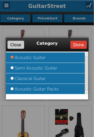
Our goal was to make it fast, even if its not rendering the exact desktop version, user should not miss any content just because he opened it in mobile. The beauty of GuitarStreet lies in product discovery, you can find any product from any page. Its very simple and straightforward. Replicating the filter bar of Desktop version took us little time, because the kind of filters we are using, it would take more real estate then its available in mobile, so divided our filters in 3 parts and made them look independent so that user can choose from them easily.
Final discussion was, whether or not redirect mobile users to mobile version of the website.The decision was simple, We don’t need to redirect user because its the same website which is rendering in Adaptive way.
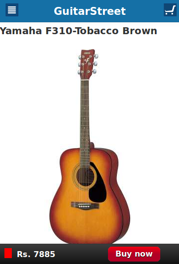
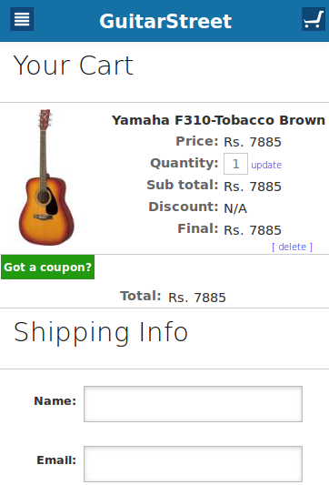
Here are some screenshots of our mobile version.


Checkout http://www.guitarstreet.in in your mobile device and remember to give feedback.